Friday, November 29, 2019


Greetings!!  I only have a couple of things to share here.  I just did a few more Happy Mail envelopes.  Well, okay, eleven more!  So, just wanted to share them with you.  I used the round "border" rubber-stamp this time, instead of the leaves.  They all started with gelli-prints on a plain, cream-colored cardstock.  You can see how I do them here!  (There are a few videos there, showing the entire process, start to finish, including making the flaps!)  Have fun with it!


And here are some deli-paper flowers!  (Video will be done later, if people are interested.)  These are fun (and meditative!) to do and can be used in mixed-media art, whether it's in an art-journal or on a canvas....wherever!  Just glue them down.  :)


Tuesday, January 29, 2019

Envelope Flaps... do I have a problem??

I think I have a problem.  Seriously.  I think I'm addicted to creating these envelopes!  Here are some more that I just finished up.  So, I made the flaps, first (they're included in the video series; this is Part 2, where the exciting stuff starts happening!) and then added them to the envelopes.

For a little close-up view.....


 And here they are, added to the envelopes.  Once the envelopes are filled with goodies, then those flaps will be folded to the back, secured with glue and sewn over the washi-tape that covers that edge.


Here are some shots of the other end, just so you can see the other areas of the envelopes and not only the flaps!  :)  


This one includes part of the address label that I created from old ledger-paper.


This gives you a better view of the zig-zag stitching I do all around the edges; for interest and to secure the washi-tape... it's not very sticky tape.  :)


There are several videos, showing how to create these, from start to finish!  Please be patient and watch them all the way through.  If you're in a hurry when you're doing art, or being creative in any manner, you're kind of missing the point.  :)  Thanks for watching!  This is the first one... and the rest are on my You Tube channel. 


Friday, January 25, 2019

Greetings!!  Happy 2019!!  I'm feeling like this is going to be a good year!  I hope you are, as well.  I've just spent two and a half days working on my tutorial videos that I've been talking about doing for.... um, how long?  (Let's not talk about that part!)  So, I did them.  I had to break them up; they're too long and I say, "Um" too much.  But, it's very odd, sitting there, alone, and trying to talk about what you're doing, for an audience (hopefully!!), but there's actually no one there to talk to.  It's going to take some getting used to, for sure.  I tried figuring out the editing software that I downloaded yesterday.... I figured out one little thing on it, so sort of jumped ship on that.  So, anyway, enough of that!  The videos are specifically for creating your own Happy Mail envelopes, to send off to fellow mixed-media artists.  The idea is that they can tear them up and use them in their own artwork.  I start with gelli-prints on 8.5 x 11" plain cardstock.. and work my way all the way up to creating and sewing on the address labels and then assembling the pieces to create an envelope.  I hope you'll have a look and will be inspired to try your own!  Be creative with it!  :)  I just realized that some of these are envelopes that I bought, already made, and then decorated them.  But, you can tell if I made them or not... they'll have a big, scalloped flap on the back!  Those are the ones that are in the video.  The video is here!  Thanks for looking!  Oh, and also... the techniques used in the envelopes and the flaps can both be used in various mixed-media projects.  They aren't specifically for this kind of project.  :)  


Saturday, March 3, 2018

Sneak-peek: Homemade envelopes for Happy Mail!

Oh, my... it's been so long!!  Well, I've been getting my art in by doing Happy Mail!  The last two batches I did, I made my own envelopes, including the one shown here.  So, this is just a little sneak-peek of what's coming!  I'll do a post, hopefully later today, sharing how I created the flaps (made separately) and how I put the envelopes together.  SO much fun!  

Monday, February 6, 2017

Feb 6th: How Do You Beat the Winter Blues?

Greetings!!  Here is Feb. 6th's Prompt/Challenge.  The prompt is, "How do you beat the winter blues?" and the Challenge is to use watercolors.  It can be watercolor pencils, Neo-Colors, Twinkling H20's, etc... or just straight-out-of-the-tube watercolors.  Your choice, but just use some in there, somewhere.  I used Caran d'Ache's Neo-Colors.  I put them down dry, then added water with a regular paintbrush and worked them around.  I just wanted light colors in the background... almost like a wash.


After that dried, I penciled in scallops around the outer edge.  I decided that I wanted a "window" to write stuff in, so I added scallops to create that.


Then, I used Tombow markers to fill in the scallops.  I used #'s 373 and 685.  I outlined them with the black Pitt pen, "S".  (On Pitt pens, "S" stands for super-fine.)


Using my black Pitt pen, I filled in the window, first, with all the things that help me to beat the winter blues.  (Suddenly, I'm really tired of the rain!!)  Then, I used a Tombow, #133, to put the brackets around each item.  Added the little dots, to separate each item.... and went around those and added the straight lines with the Pitt pen.  Then, with my mechanical pencil, I penciled in the block letters up at the top.  Wasn't sure if I wanted to use markers, regular watercolors or acrylics in them, but decided on acrylics.  Martha Stewart's "Pollen" yellow... a beautiful, soft yellow.  (When I see it on the Joann's site, it looks much darker and more orange!)  After all the lettering was filled in with paint, I outlined it with the Pitt pen, putting an extra-wide line on the left side of all the edges of the yellow.  Does that make sense?  So, like in the center of the "O", I thickened the line on the right side of the center, but the left side of the right-yellow part of the "O".  Anywhere there is a vertical part of the yellow, it gets thickened on its left side.  Sheesh... I don't know why that's so difficult to explain!  Please leave me a comment and ask about it, if you're confused!!  :)  I then took my white Sharpie Paint-pen with the extra-fine point and added all the markings in the scallops.  I decided to add little groupings of three dots all over the watercolor background that's outside the "window".  I thought the inside of the window was busy enough.  :)


Next week is St. Valentine's Day, folks!  (Hint-hint!)  You don't need a partner in order to have love; you only need a heart.  :)

Remember, these prompts/challenges are for the Inspired Mixed-Media, Altered-Arts Group on Facebook... please come join us there... and share your work with us!!  :)

Have a wonderful week!

  ~ Teri


Monday, January 30, 2017

January 30th: Groundhog Day! What does "Shadow" mean to you?

January 30:  Groundhog Day is coming, so this week's prompt/challenge is about Shadows.  Whatever that means to you. I focused on our "shadow side"; the dark within us that, if given any chance, will raise its ugly head up.  :(

I started with three colors and instead of spreading them around, I dabbed them around.  (I'm going to call it a "paper-towel", but what I really used was my dried-up "lens wipe" for my glasses.  :) )


So, I dabbed the paint around until it looked like this.  No spreading.... only quick, up and down movements with the paper-towel.


I'm going to keep this one more simple, overall.  Next, I used the Dylusions Vibrant Turquoise paint and that sweet TCW stencil, by Rebekah Meier and added a bit to one corner.  Be sure to use a make-up sponge or paper-towel and dab the excess off, first, before putting paint over your stencil.  If you have too much paint on whatever you're using, it'll end up seeping underneath and just look messy.  Also, dab with one hand and hold the stencil down firmly with the other!  You don't want your stencil moving around on you.


Then, I started sketching.  I used a brown Prismacolor colored pencil, so it'd be darker and could move more easily over the acrylic paints than a regular pencil would.  I wanted to make my person look androgynous - neither male nor female - and very angry, because we all have the ability to let our Shadow side take over!!  I think it ended up looking more female, though.  :(   I painted in the shadow, first, with some Dark Violet (Golden's permanent) and Ceramcoat's Burnt Umber.  I'd never painted a shadow like this before, so that was interesting!  ;)  

Then, I started using acrylics to paint him/her.  (I used Americana "Tangerine", the Golden Dark Violet, and Dylusions Vibrant Turquoise for the clothing/shoes)  Wanted the hair to look wild and crazy.  After that, I decided that all the negative thoughts of our Shadow-side should be down below.... "love" is at the top.  So, I wrote in all the negative aspects that I could think of, with a black Pitt pen, "S"   I outlined with the Pitt pen, adding lines for creases, etc...  I used Folk Art's "Brilliant Blue" for the eyes and Americana's "Tomato Red" for the lips.  Used my finger to brush on a tiny bit of the Tomato Red, to make him/her look more angry.  Then, I used a Sakura Pigma Sensei with a .06 point to add the main text.  (I can only find them in sets, online, but I'm pretty sure I bought mine individually, either at Staples or Craft Warehouse.)  I added the "love" with my White water-based Sharpie Paint-Pen, extra-fine point.  Waited for it to dry, then outlined it with a Tombow Magenta (#685), with the finer-pointed end.  Added some outlines (but not entirely) on the main text with the Tombow Magenta.  Went over the "all", to emphasize it, with the Paint-Pen. Lost some of the black, so filled that in with the Pigma Sensei again.  And, here it is, finished!  Remember, click on photos to make them larger!  AND, all bloggers love to get comments, so, please, leave me a comment!!  (Just click on the comment button - it's easy!)


Have a wonderful week!  Happy Creating!!

             ~  Teri


Friday, January 27, 2017

January 16th: A prompt and a challenge

Happy New Year!  It's been far too long since I've been here.  😏 I'm hoping to change my ways... to do more art and to share it here. I run the Inspired Mixed-Media Altered-Arts Group on Facebook and decided it was time to do some challenges, once again.  So, I'm putting them out there on Mondays.  The first one should've been Jan. 16th, but I was a couple of days late, so we skipped the 23rd. Next one will go out Jan. 30th.  If you're interested in this kind of art, you're certainly welcome to join us over there!  (Do a search for the aforementioned group name on FB and you'll find us!)  So, since it's a new year and I always feel like the new year gives me a clean slate, the prompt is, "What will I do with a clean slate?" and the challenge is using security envelopes (that have cool designs on the inside) as part of your foundation.  So, here we go!  You can click on any of the following pictures and it'll take you to the original-sized photo, to get a better look.

I'm using Dyan Reaveley's Dylusions Art Journal in the 5 x 8" size.  The first picture shows you what it looks like when you open it... it even has an envelope for storing images, etc.... has a wonderful thick-chipboard cover (ready for your beautiful artwork!) and an elastic band, to hold it together.  

                                                The next picture shows how big the pages are.  My hands aren't very big, but since this type of art is generally done across both pages, it gives you plenty of room to work. 


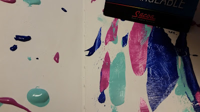
I used the Liquitex Super Heavy Gesso for this.  The heavier the gesso, the more texture you can get out of it.  If you look closely at the above photo, you can see some of the texture that I created by dabbing my foam brush onto the page, in quick movements. After letting it dry (one of the most difficult things to do (!!) but, you can hit it with a heat-gun if you don't want to wait), I put some dabs of three colors of paint all around on the pages.  Oh!  But, first... put either waxed paper or deli-paper behind the pages that you're working on so you don't make a mess of your other pages!  Trust me, the paint can get everywhere!  :)


Then, with a credit-card (or something similar), I use the edge and start spreading the paint around.  Yes, one color goes into the other.. that's what you want.... but, don't keep going over and over certain spots, or you'll end up with mud.  Not good, unless that's the look you're going for.  :)


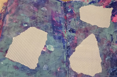
I lost a lot of the Patina green and the Vivid Violet, so added a bit more in.  Ended up being too green, so I used a wet-wipe to try to take a bit of paint off.  It wouldn't lift off very well, so I went ahead and added my security envelope pieces.  One of the things to remember with this kind of art - your backgrounds are only backgrounds!  They are not a masterpiece unto themselves.  So, don't worry too much about them.  The trick with mixed-media is layers, layers, layers!!  So, the background is most likely going to be augmented by other things.  Don't get too hung up on the backgrounds.

Unless you're putting your foundation papers right up against the edge of the page, don't lay down papers with straight-cut edges. Tear your papers!  It will give it a more organic, natural feel/look.  I tore up the security envelope in random ways.  I took three pieces and adhered them to my page with Mod-Podge.  Play around with where you'd like them to be before gluing them down.


Now, it's time to add some paint, to cover those up a bit.  You want to almost cover them, but not completely.  (The other way you can do this, of course, is to put these pieces down as part of your foundation, right on top of the gesso, and then add paint.) I put down dabs of Folk Art's Patina and Americana's Melonball and spread them around, once again with my trusty "credit"-card.


                                                                                                            I still didn't have much of the "pink" showing, so I decided to put some down with my finger.  When I do this, I do not put dabs of paint all over the page!  I just put a dab on my finger and apply it that way.  I'm never sure how much it's going to take, so go about it slowly, adding little touches here and there, until it seems right.


For the pink, I used Dylusions "Bubblegum Pink" - spread around with my finger.  I also added the same brand of paint, in "Vibrant Turquoise".  (Love those Dylusions paints!!)

Now, for the real fun!  I used StazOn "Jet Black" ink to apply flourishes onto three of my corners. Remember, as odd as it seems (no pun intended), there is more balance in odd numbers than there is in even numbers.  So, I only put them on three corners.  You don't want it to look all uniform, unless you're doing a piece where that would work.


 Next, I used my favorite piece of bubble-wrap (isn't it gorgeous??); dabbed some Dylusions "Fresh Lime" paint onto a small spot of it and applied that in a few areas on my piece.  Once again, in an odd amount of spots.  I then used Dyan Reaveley's wonderful scallop rubber stamp and StazOn (Jet Black again) and stamped along the side edges.  I will fill those in with paint, later, but I also want to add some painted circles to the piece and I want to use the same colors, so it's more cohesive.....I'm waiting to see what colors I end up using for the circles.  So, the picture below shows the bubble-wrap spots and the scallops on the edges.


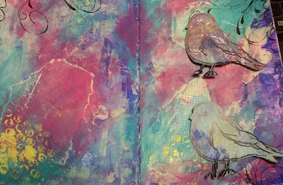
I wanted to add a "Scribbly Bird", using Dina Wakley's cute rubber stamps.  I found some gelli-prints that I'd already done and stamped on those.  I cut out a couple of them, to see how they'd look on the piece.  


Then, I realized that the colors weren't right on either of them, so I started playing with some color.  I brushed on some Melonball, to lighten it up.  Did another one with Dylusions "Fresh Lime" and Folk Art's "Brilliant Blue".  Liked that one better and thought it'd show up better on the page.  


Here's a weird thing... as I said, I did these gelli-prints a long time ago, but as it turns out, the one I chose to add here was done on the exact same security envelope design as what I used here in my background!  How weird is that??  OK, moving right along.  

I thought the bird needed more highlighting, so added a bit of Golden's Fluid Acrylic, permanent, "Violet Dark".. it's Dark Violet, but that's what they call it.  I'm talking about teeny bits of paint at a time, with a #1 brush.  Then, I noticed that light spot on the bird's foot... draws your eye there too much... so I dabbed on some Brilliant Blue to cover it.  Ugh!  That made it too dark!  So, I used a wet-wipe and dabbed over it, to take a bit up.  It just seemed too monotone - all blue - so I dabbed on some Fresh Lime with my finger and softened it with my wet-wipe.  I then noticed that the beak needed some definition - it kind of got lost in there!  My tiniest brush was still wet so I had to use a #4.  It was really too big and the whole thing was too filled in and looked bad!  So, once again, I used my trusty wet-wipe and dabbed it on there, to removed some paint and soften it up.  I used the Brilliant Blue on that so it would tie in with the other Brilliant Blue.


Then, I started adding my circles.  Just free-hand, painted circles, using the colors I'd already used, but not blended; just straight color.  I painted the smaller circles first, then added in the larger ones that look like they're behind the smaller ones.  The bird isn't adhered to the page, yet; still deciding where it should go.  Now, to add highlights and shadows to my circles.  Shadows aren't created with black paint.  Generally speaking, you mix the color of the thing that you're shadowing (in this case Dark Violet) with its complementary color - the color opposite to it on the color wheel; in this case, Fresh Lime.  But, that didn't create a dark enough color, so I added some Burnt Umber and that worked.  For the highlights, I used the color of the circle; for instance, Melonball, and then added some white, to make it a shade or two lighter.  I decided where my shadows should be, first - and made them all the same.  So, my shadows are on the right/bottom'ish of each circle and my highlights are at the left/top'ish.  Imagine where the light is coming from.... if it's the left, then your highlights should be at the left and that would naturally create a shadow on the right.  Anyway, I put the paint down in its respective area and used a dry brush to move it around a bit.  If it dried too quickly, I used my wet-wipe to dampen it so I could move it around and maybe soften the color. 


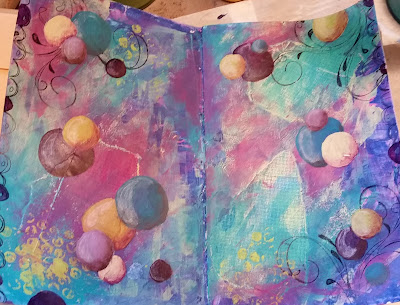
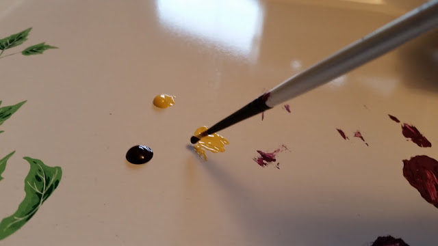
Note:  When mixing color (two, for instance), you don't want to put both colors down together, in one spot.  You want to put them down in their own spots and then start a new spot with one of them and slowly add bits of the other color to that spot.  See how I put yellow in another spot?  Then, I'm adding the violet to that yellow, bit by bit, until I get the right color.  You might have to add more yellow in!  Don't just throw them together, right off, because you don't know how much of either one it will take to get your desired color. 


I then used a General's water-soluble black pencil around the circles.  I painted in the scallops with the (Folk Art) Brilliant Blue and Patina; Americana brand of Vivid Violet, Golden's Dark Violet and Dylusions Fresh Lime.  I adhered the bird with Mod-Podge.  Used white charcoal around the bird.  I went over the scallops with a black Pitt pen, "S", because some of that had gotten painted over, accidentally.  Added the text with a White, water-based Paint Pen, extra-fine point, Sharpie.  (I use those all the time!!)  Added all the little dots with the same pen.  Did the black text at the bottom with the Pitt pen.  I thought I was done!  Then, when I looked at it this morning, it just hit me that the bird needed a tiara!  I'd just seen one in my stuff, so cut that out, put some Color Box Pigment Brush Pad (Cat's Eye) "Merlot" on the edges and glued it down with Mod-Podge.  So, here is the finished product!  I hope you learned something and had fun doing your own!  
See you next week!  

      ~ Teri